Frameworks > BoldKit
A neubrutalism-styled Vue 3 & Nuxt component library with 45+ components, 35 SVG shapes, and charts. Built on Reka UI and compatible with shadcn-vue CLI.
BoldKit

Bold. Raw. Beautiful.
A neubrutalism component library for React and Vue 3, built on shadcn/ui.
Website · Documentation · Components · Charts · Shapes
What's New in v3.2.1
🎨 Canvas Effects — 10 Animated Canvas Components
10 self-contained animated canvas components at /canvas-effects, requiring zero external dependencies. Drop any component into a sized parent and it fills it 100% — ResizeObserver handles reflow automatically.
All 10 effects:
- Dot Blob — Gaussian envelope × crossing waves drive halftone pixel sizes
- Aurora — Curtains of light ripple across a star-filled sky
- Dot Wave — Dual crossing sine waves modulate dot size and opacity
- Matrix Rain — Columns of glowing heads and fading square character trails
- Particle Web — Floating particles connected by proximity-faded lines
- Mouse Ripple — Cursor interaction sends sine ripples through a dot grid
- Flow Field — Particles follow a smooth value-noise angle field
- Metaballs — Colored blobs merge via r²/d² scalar field threshold
- Lissajous Grid — 4×3 table of parametric curves with phase drift
- Plasma Waves — 4 drifting wave sources create shifting color interference
Install via CLI:
# React
npx shadcn@latest add "https://boldkit.dev/r/aurora.json"
npx shadcn@latest add "https://boldkit.dev/r/dot-blob.json"
npx shadcn@latest add "https://boldkit.dev/r/dot-wave.json"
npx shadcn@latest add "https://boldkit.dev/r/flow-field.json"
npx shadcn@latest add "https://boldkit.dev/r/lissajous-grid.json"
npx shadcn@latest add "https://boldkit.dev/r/matrix-rain.json"
npx shadcn@latest add "https://boldkit.dev/r/metaballs.json"
npx shadcn@latest add "https://boldkit.dev/r/mouse-ripple.json"
npx shadcn@latest add "https://boldkit.dev/r/particle-web.json"
npx shadcn@latest add "https://boldkit.dev/r/plasma.json"

# Vue 3 / Nuxt 3
npx shadcn-vue@latest add "https://boldkit.dev/r/vue/aurora.json"
npx shadcn-vue@latest add "https://boldkit.dev/r/vue/dot-blob.json"
npx shadcn-vue@latest add "https://boldkit.dev/r/vue/dot-wave.json"
npx shadcn-vue@latest add "https://boldkit.dev/r/vue/flow-field.json"
npx shadcn-vue@latest add "https://boldkit.dev/r/vue/lissajous-grid.json"
npx shadcn-vue@latest add "https://boldkit.dev/r/vue/matrix-rain.json"
npx shadcn-vue@latest add "https://boldkit.dev/r/vue/metaballs.json"
npx shadcn-vue@latest add "https://boldkit.dev/r/vue/mouse-ripple.json"
npx shadcn-vue@latest add "https://boldkit.dev/r/vue/particle-web.json"
npx shadcn-vue@latest add "https://boldkit.dev/r/vue/plasma.json"
Each component installs to components/ui/canvas-effects/ with zero external dependencies.
Usage after install:
// React — components install to components/ui/canvas-effects/
import { Aurora } from '@/components/ui/canvas-effects/Aurora'

<div style={{ height: '400px' }}>
  <Aurora colors={['#00ffaa', '#00beff', '#78ff64']} starCount={160} speed={1} />
</div>
<!-- Vue 3 / Nuxt 3 — components install to components/ui/canvas-effects/ -->
<script setup>
import Aurora from '@/components/ui/canvas-effects/Aurora.vue'
</script>
<template>
  <div style="height: 400px">
    <Aurora :colors="['#00ffaa', '#00beff', '#78ff64']" :star-count="160" :speed="1" />
  </div>
</template>
All effects run in onMounted / useEffect — SSR-safe in Nuxt 3 by default. Wrap in <ClientOnly> if you encounter hydration warnings.
What's New in v3.2.0
🎨 Dot Matrix Studio — In-browser pixel art & animation editor
A fully-featured dot matrix animation studio at /studio. Draw pixel art on a 16×32 grid with freehand, line, rectangle, fill, and selection tools. Build frame-by-frame animations with 10 built-in presets:
- Blink — your art alternates with a blank frame
- Typewriter — columns reveal left-to-right or right-to-left
- Scan Line — rows sweep top-to-bottom or bottom-to-top
- Marquee — art scrolls and wraps horizontally
- Ripple — expands or contracts from the center outward
- Bounce — ping-pong marquee with auto-reverse
- Slide — art slides in from any edge
- Wave — columns undulate vertically via a sine wave
- Rain — Matrix-style drops fall in staggered columns
- Fade — dithered dissolve in or out
Export animations as WebM video, PNG sprite sheets, SVG frames, or JSON (re-importable). Selection actions (Fill / Clear / Invert) available in select mode. Undo/redo with full history, customizable dot color, FPS control, and loop modes (once / 3× / infinite).
Preview
55+ beautifully crafted neubrutalism components, 10 chart types, 64 SVG shapes, 17 animated ASCII shapes, 10 canvas effects, and 15 math curve animations for React and Vue 3
What is Neubrutalism?
Neubrutalism (or neo-brutalism) is a bold design aesthetic characterized by:
- Thick Borders - 3px solid borders that define elements
- Hard Shadows - Offset shadows with no blur (4px 4px 0px)
- Bold Colors - High-contrast, vibrant color palettes
- Raw Typography - Bold, uppercase text for emphasis
- Zero Radius - Square corners for that raw, unpolished look
Features
| Feature | Description |
|---|---|
| 55+ Components | Buttons, Cards, Dialogs, Forms, Spinners, Steppers, and more |
| 10 Chart Types | Bar, Line, Area, Pie, Donut, Radar, Radial, Gauge, Sparkline |
| 64 SVG Shapes | Decorative shapes (geometric, organic, mathematical, mechanical) with interactive Shape Builder |
| 17 ASCII Shapes | Animated 3D ASCII art — Torus, Donut, Sphere, Cube, Helix, Trefoil Knot, Saturn, DNA, and more |
| Dot Matrix Studio | In-browser pixel art & animation editor with 10 presets, WebM/PNG/SVG/JSON export |
| 10 Canvas Effects | Animated canvas components — Aurora, Flow Field, Plasma, Metaballs, Matrix Rain and more. Zero deps. |
| Math Curve Components | Animated loaders, progress bars, and backgrounds powered by 15 mathematical curves |
| React & Vue 3 | Full support for both frameworks |
| Nuxt Ready | SSR-compatible with shadcn-nuxt module |
| shadcn CLI | Install via shadcn (React) or shadcn-vue (Vue/Nuxt) |
| Accessible | Built on Radix UI (React) & Reka UI (Vue) |
| Dark Mode | Full light/dark theme support |
| TypeScript | Complete type safety |
| Tailwind v4 | Modern CSS with latest Tailwind |
Quick Start
React (shadcn CLI)
# Install a component
npx shadcn@latest add https://boldkit.dev/r/button.json

# Install multiple components
npx shadcn@latest add https://boldkit.dev/r/button.json https://boldkit.dev/r/card.json https://boldkit.dev/r/input.json

# Install shapes
npx shadcn@latest add https://boldkit.dev/r/shapes.json

# Install theme (CSS variables)
npx shadcn@latest add https://boldkit.dev/r/theme.json
Vue 3 (shadcn-vue CLI)
# Install a component
npx shadcn-vue@latest add https://boldkit.dev/r/vue/button.json

# Install multiple components
npx shadcn-vue@latest add https://boldkit.dev/r/vue/button.json https://boldkit.dev/r/vue/card.json https://boldkit.dev/r/vue/input.json

# Install shapes
npx shadcn-vue@latest add https://boldkit.dev/r/vue/shapes.json

# Install theme (CSS variables)
npx shadcn-vue@latest add https://boldkit.dev/r/vue/theme.json
Nuxt
# 1. Add shadcn-nuxt module
npx nuxi@latest module add shadcn-nuxt

# 2. Initialize shadcn-vue (select Nuxt when prompted)
npx shadcn-vue@latest init

# 3. Install BoldKit components
npx shadcn-vue@latest add https://boldkit.dev/r/vue/button.json
nuxt.config.ts:
export default defineNuxtConfig({
  modules: ['shadcn-nuxt'],
  shadcn: {
    prefix: '',
    componentDir: './components/ui'
  }
})
Note: Some components (Drawer, Sonner, Command, Calendar, Chart) require
<ClientOnly>wrapper for SSR. See the Nuxt installation guide for details.
Using Registry Alias
React - Add to your components.json:
{
  "registries": {
    "@boldkit": "https://boldkit.dev/r"
  }
}
Vue - Add to your components.json:
{
  "registries": {
    "@boldkit": "https://boldkit.dev/r/vue"
  }
}
Then install:
npx shadcn@latest add @boldkit/button @boldkit/card @boldkit/input
# or for Vue
npx shadcn-vue@latest add @boldkit/button @boldkit/card @boldkit/input
Usage
React
import { Button } from '@/components/ui/button'
import { Card, CardHeader, CardTitle, CardContent } from '@/components/ui/card'
import { Badge } from '@/components/ui/badge'

export function Example() {
  return (
    <Card>
      <CardHeader className="bg-primary">
        <CardTitle className="flex items-center gap-2">
          Welcome to BoldKit
          <Badge variant="secondary">New</Badge>
        </CardTitle>
      </CardHeader>
      <CardContent className="space-y-4">
        <p>Build bold, beautiful interfaces with ease.</p>
        <div className="flex gap-2">
          <Button>Primary</Button>
          <Button variant="secondary">Secondary</Button>
          <Button variant="accent">Accent</Button>
        </div>
      </CardContent>
    </Card>
  )
}
Vue 3
<script setup lang="ts">
import { Button } from '@/components/ui/button'
import { Card, CardHeader, CardTitle, CardContent } from '@/components/ui/card'
import { Badge } from '@/components/ui/badge'
</script>

<template>
  <Card>
    <CardHeader class="bg-primary">
      <CardTitle class="flex items-center gap-2">
        Welcome to BoldKit
        <Badge variant="secondary">New</Badge>
      </CardTitle>
    </CardHeader>
    <CardContent class="space-y-4">
      <p>Build bold, beautiful interfaces with ease.</p>
      <div class="flex gap-2">
        <Button>Primary</Button>
        <Button variant="secondary">Secondary</Button>
        <Button variant="accent">Accent</Button>
      </div>
    </CardContent>
  </Card>
</template>
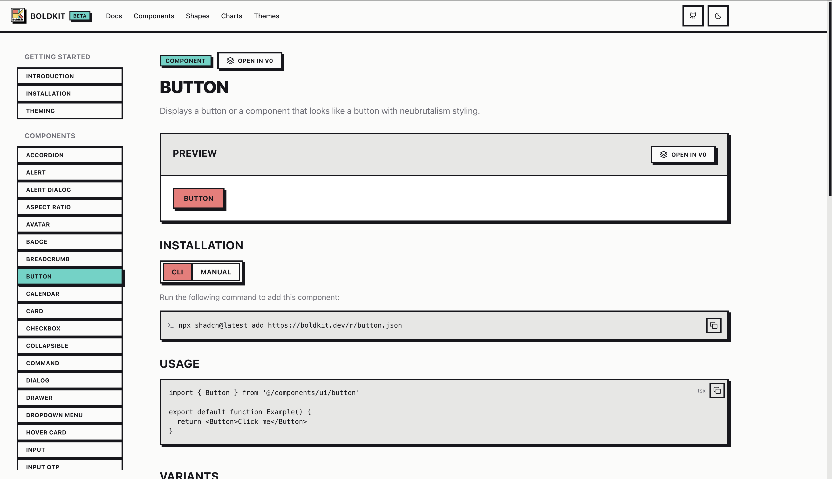
Components
Form Components
- Button (7 variants, 5 sizes)
- Input
- Textarea
- Checkbox
- Radio Group
- Select
- Switch
- Slider
- Label
- Input OTP
- Dropzone (drag-and-drop file upload) ✨ NEW
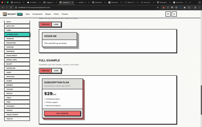
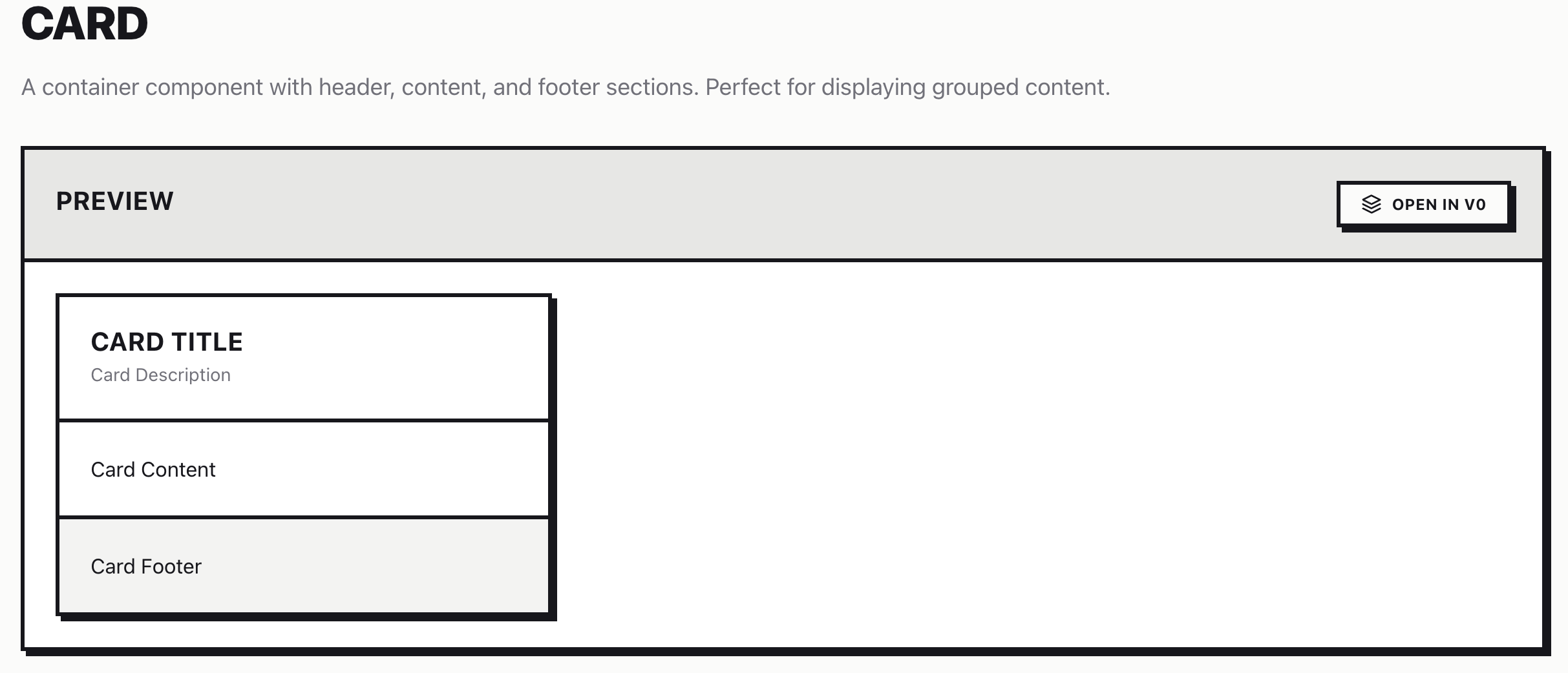
Layout & Containers
- Card
- Layered Card (stacked paper effect)
- Stat Card (statistics display) ✨ NEW
- Dialog
- Drawer
- Sheet
- Accordion
- Collapsible
- Tabs
- Stepper (multi-step forms/wizards) ✨ NEW
- Scroll Area
- Aspect Ratio
- Separator
Feedback & Status
- Alert
- Alert Dialog
- Badge
- Progress
- Skeleton
- Spinner (5 animation variants) ✨ NEW
- Sonner (Toast)
- Math Curve Loader (animated loading spinners driven by mathematical curves) ✨ NEW
- Math Curve Progress (progress bars rendered as animated mathematical curves) ✨ NEW
- Math Curve Background (full-bleed animated curve backgrounds) ✨ NEW
Navigation
- Breadcrumb
- Dropdown Menu
- Command Palette
- Pagination
- Popover
- Tooltip
- Hover Card
Data Display
- Avatar
- Table
- Calendar
- Kbd (keyboard shortcut hints) ✨ NEW
Charts (10 Types)
- Area Chart
- Bar Chart
- Line Chart
- Pie Chart
- Donut Chart (pie with center content) ✨ NEW
- Radar Chart (multi-variable comparison) ✨ NEW
- Radial Bar Chart (circular progress) ✨ NEW
- Gauge Chart (speedometer KPI) ✨ NEW
- Sparkline (inline trend charts) ✨ NEW
Decorative (Neubrutalism Special)
- Sticker (rotated labels)
- Marquee (scrolling ticker)
- 64 SVG Shapes (Geometric, Organic, Celestial, Mathematical, Mechanical, and more) ✨ EXPANDED
- 17 ASCII Shapes (Torus, Donut, Sphere, Cube, Helix, Trefoil Knot, Geodesic Dome, Saturn, Hyperboloid, DNA, Spiral, Rose, Wave, Vortex…) ✨ NEW
- Shape Builder (interactive tool to customize shapes, export SVG/JSX) ✨ NEW
Math Curve Components
15 animated mathematical curves (Lissajous, Hypotrochoid, Epitrochoid, Rose, Spirograph, and more) rendered as interactive UI elements — no external animation library required.
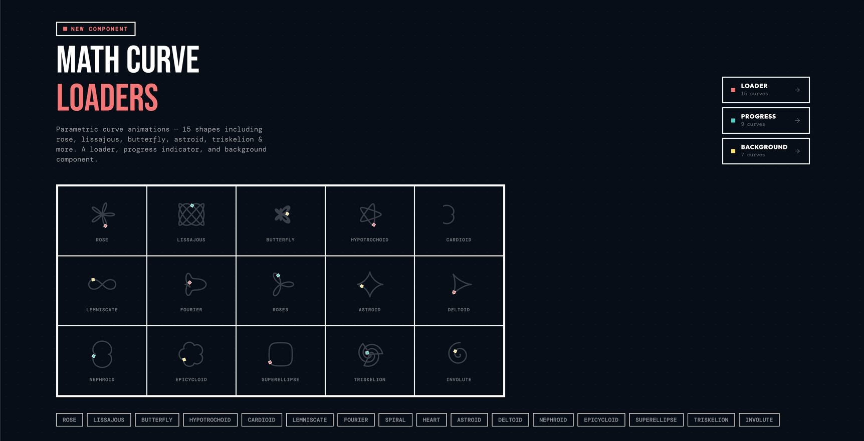
MathCurveLoader
import { MathCurveLoader } from '@/components/ui/math-curve-loader'

<MathCurveLoader curve="lissajous" size="md" speed="normal" />
<MathCurveLoader curve="rose" size="lg" speed="slow" />
<MathCurveLoader curve="spiral" size="xl" speed="fast" />
MathCurveProgress
import { MathCurveProgress } from '@/components/ui/math-curve-progress'

<MathCurveProgress value={65} curve="lissajous" />
<MathCurveProgress value={40} curve="rose" showLabel />
MathCurveBackground
import { MathCurveBackground } from '@/components/ui/math-curve-background'

<MathCurveBackground curve="lissajous" opacity={0.15}>
  <YourPageContent />
</MathCurveBackground>
Shapes
64 decorative SVG shapes across 8 categories for unique neubrutalism layouts:
React
import { BurstShape, HeartShape, LightningShape } from '@/components/ui/shapes'

<BurstShape size={100} className="text-primary" />
<HeartShape size={80} filled={false} strokeWidth={4} />
<LightningShape size={60} className="text-accent" />
Vue 3
<script setup lang="ts">
import { BurstShape, HeartShape, LightningShape } from '@/components/ui/shapes'
</script>

<template>
  <BurstShape :size="100" class="text-primary" />
  <HeartShape :size="80" :filled="false" :stroke-width="4" />
  <LightningShape :size="60" class="text-accent" />
</template>
Shape Builder
The interactive Shape Builder lets you customize any shape's size, color, stroke width, and fill, then export it as SVG or copy it as JSX/Vue template code ready to paste into your project.
ASCII Shapes
17 animated ASCII art components rendered with perspective projection, z-buffering, and Lambertian shading — no canvas, no WebGL, just text characters:
| Shape | Description |
|---|---|
AsciiTorus |
3D rotating torus with z-buffering and Lambertian shading |
AsciiDonut |
Classic donut.c doughnut — faithful a1k0n algorithm, hole always visible |
AsciiSphere |
Rotating globe with lat/lon grid texture and Lambertian shading |
AsciiCube |
Solid shaded cube rotating on two axes with back-face culling |
AsciiHelix |
Double helix with two strands and connecting rungs |
AsciiTrefoilKnot |
Trefoil knot tube with Frenet frames, z-buffer, and Lambertian shading |
AsciiGeodesicDome |
Frequency-3 icosahedron wireframe projected onto a sphere |
AsciiSaturn |
Planet with tilted solid ring system and Cassini division gap |
AsciiHyperboloid |
Two families of straight-line rulings on a ruled surface tower |
AsciiDNA |
B-form DNA double helix: 150° strand offset, 4 turns, tube backbone + rungs |
AsciiSpiral |
Archimedean spiral arms rotating continuously |
AsciiRose |
Rose curve r=cos(5θ) blooming and phase-shifting |
AsciiWave |
Multi-frequency sine interference pattern |
AsciiVortex |
Rotating density field collapsing toward center |
AsciiPulse |
Concentric rings expanding outward and fading |
AsciiMatrix |
Characters raining downward per column |
AsciiGrid |
Grid intersections pulsing with traveling waves |
React
import { AsciiTorus, AsciiDonut, AsciiSphere } from '@/components/ui/ascii-shapes'

// Basic usage
<AsciiTorus />

// With options
<AsciiDonut
  size="md"          // 'sm' | 'md' | 'lg' | 'hero'
  charset="classic"  // 'blocks' | 'braille' | 'classic' | 'line' | 'dots'
  speed="normal"     // 'slow' | 'normal' | 'fast'
  color="#e74c3c"    // any CSS color string
  animated={true}    // false = static snapshot, SSR-safe
/>

// Multicolor — cycles primary/secondary/accent/warning/info/success per row
<AsciiSphere size="lg" charset="classic" multicolor />
Vue 3 / Nuxt
<script setup lang="ts">
import { AsciiTorus, AsciiDonut } from '@/components/ui/ascii-shapes'
</script>

<template>
  <AsciiDonut size="md" charset="classic" />

  <!-- In Nuxt, wrap animated variants in <ClientOnly> -->
  <ClientOnly>
    <AsciiTorus size="lg" multicolor />
  </ClientOnly>
</template>
Install
# React
npx shadcn@latest add "https://boldkit.dev/r/ascii-shapes.json"

# Vue 3 / Nuxt
npx shadcn-vue@latest add "https://boldkit.dev/r/vue/ascii-shapes.json"
Theming
Customize with CSS variables (works for both React and Vue):
:root {
  --primary: 0 84% 71%;       /* Coral */
  --secondary: 174 62% 56%;   /* Teal */
  --accent: 49 100% 71%;      /* Yellow */
  --destructive: 0 84% 60%;   /* Red */
  --shadow-color: 240 10% 10%;
  --radius: 0rem;             /* Keep it square! */
}
Visit the Theme Builder to create custom themes.
Tech Stack
React
- React 19 - Latest React with concurrent features
- Radix UI - Accessible primitives
- Recharts - Data visualization
Vue 3
- Vue 3 - Composition API with
<script setup> - Reka UI - Accessible primitives (Radix port for Vue)
- vue-echarts - Data visualization
Nuxt
- Nuxt - Vue meta-framework with SSR support
- shadcn-nuxt - Official Nuxt module for shadcn-vue
- Auto-imports - Components auto-imported from
components/ui - VueUse - SSR-safe composables
Shared
- Tailwind CSS v4 - Modern utility-first CSS
- TypeScript - Full type safety
- Class Variance Authority - Variant management
- Vite - Fast development and builds
Project Structure
boldkit/
├── src/                    # React documentation site
├── packages/
│   └── vue/               # Vue 3 components
│       └── src/
│           └── components/
│               └── ui/    # Vue SFC components
├── public/
│   └── r/                 # Component registry
│       ├── *.json         # React registry
│       └── vue/
│           └── *.json     # Vue registry
Development
# Clone
git clone https://github.com/ANIBIT14/boldkit.git
cd boldkit

# Install
npm install

# Dev server (React docs site)
npm run dev

# Build
npm run build

# Build registry
npm run registry:build
Contributing
We welcome contributions! Please see our Contributing Guide and Code of Conduct.
License
MIT License - free for personal and commercial use.
Built by Aniruddha Agarwal