Kamod UI
Lightweight Preact and Tailwind UI components (shadcn-style approach) (demo).
Kamod UI
Lightweight UI components for Preact and Tailwind: composable primitives you can customize, extend, and ship without a heavy runtime. Open source; source is meant to be read and adapted.
- Live demo: ui.kamod.ch
- Repository: github.com/kamod-ch/kamod-ui
Why Kamod UI?
Many UI kits are heavier than necessary, overly opinionated, or tied to React. Kamod UI targets a smaller stack instead:
- Preact-first — tiny runtime and familiar patterns if you already use React-like APIs.
- Tailwind-native — style with utilities instead of a separate theme layer.
- Composable — build UIs from small pieces without extra abstraction.
- Practical — ship only what you need; the codebase stays easy to follow.
Comparison
| Feature | Kamod UI | Radix UI | shadcn/ui |
|---|---|---|---|
| Preact support | ✅ | ❌ | ❌ |
| Tailwind-first | ✅ | ⚠️ | ✅ |
| Lightweight | ✅ | ⚠️ | ⚠️ |
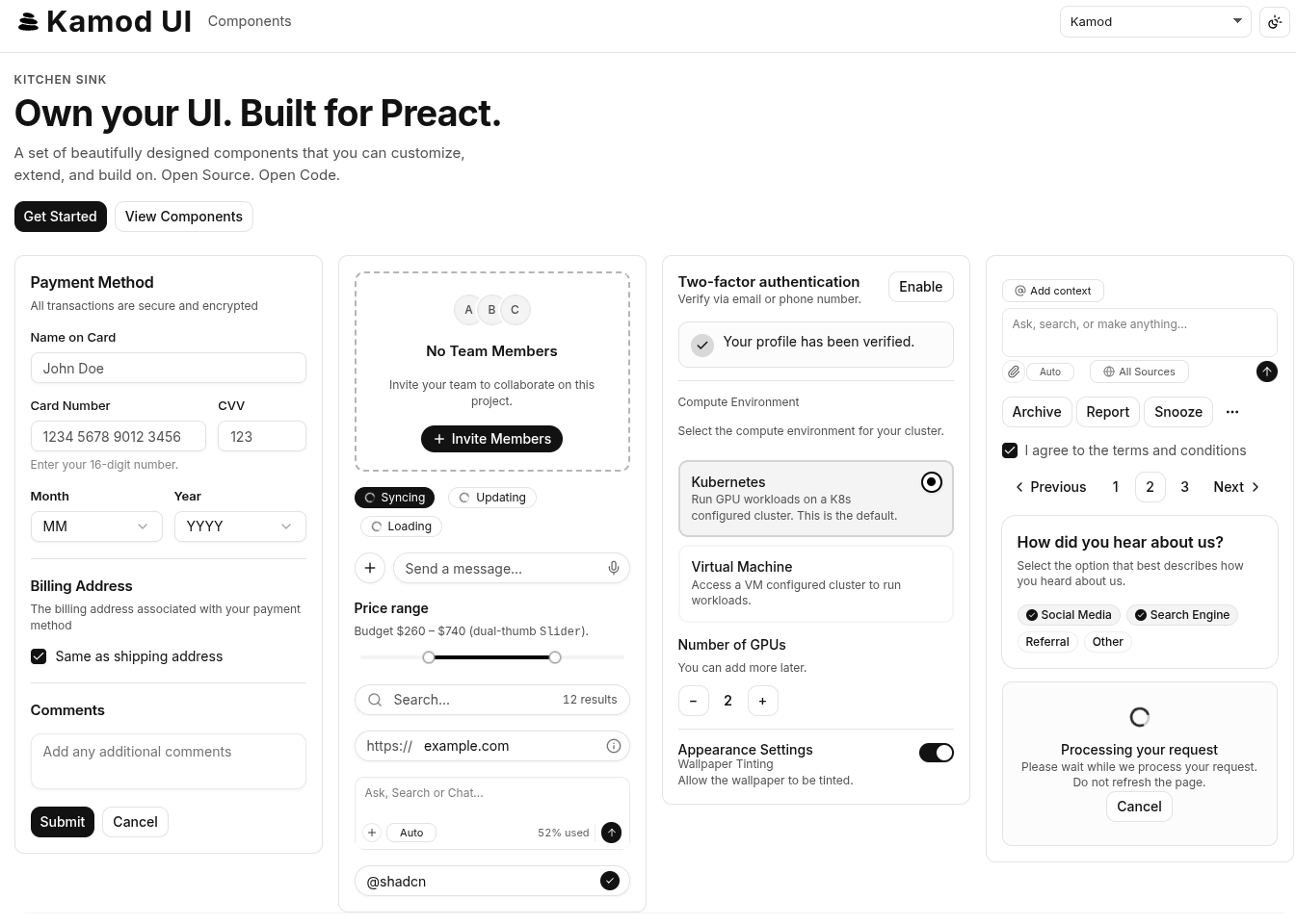
Live demo (GitHub Pages)
The deployed kitchen sink and docs live at the repository root URL of GitHub Pages, not under apps/demo (that path exists only in this monorepo):
https://kamod-ch.github.io/kamod-ui/
Documentation
Run the demo app from the repo root:
pnpm install
pnpm dev
Then open the local URL printed in the terminal to browse the kitchen sink and component docs.
Using Kamod UI
Install the component package in a Preact app:
pnpm add @kamod-ui/core preact
Kamod UI components ship JSX and Tailwind utility classes. Import the default theme once so Tailwind can compile the component classes and the components can read their semantic CSS tokens.
For Tailwind CSS v4, add this to the CSS file where you import Tailwind:
@import "tailwindcss";
@import "@kamod-ui/core/theme.css";
The theme import includes the required Tailwind source scan, dark variant and default semantic tokens.
Customize The Theme
Override the semantic tokens after importing the default theme:
@import "tailwindcss";
@import "@kamod-ui/core/theme.css";

:root {
  --primary: var(--color-fuchsia-700);
  --primary-foreground: var(--color-white);
  --radius: 0.75rem;
}

.dark {
  --primary: var(--color-fuchsia-400);
  --primary-foreground: var(--color-neutral-950);
}
If you want full control instead of the default theme, define the Tailwind mapping and token blocks yourself:
@import "tailwindcss";
@source "../node_modules/@kamod-ui/core/dist/**/*.{js,mjs}";

@custom-variant dark (&:where(.dark, .dark *));

@theme inline {
  --color-background: var(--background);
  --color-foreground: var(--foreground);
  --color-card: var(--card);
  --color-card-foreground: var(--card-foreground);
  --color-popover: var(--popover);
  --color-popover-foreground: var(--popover-foreground);
  --color-primary: var(--primary);
  --color-primary-foreground: var(--primary-foreground);
  --color-secondary: var(--secondary);
  --color-secondary-foreground: var(--secondary-foreground);
  --color-muted: var(--muted);
  --color-muted-foreground: var(--muted-foreground);
  --color-accent: var(--accent);
  --color-accent-foreground: var(--accent-foreground);
  --color-destructive: var(--destructive);
  --color-destructive-foreground: var(--destructive-foreground);
  --color-border: var(--border);
  --color-input: var(--input);
  --color-ring: var(--ring);
  --color-outline: var(--outline);
}

:root {
  --background: var(--color-white);
  --foreground: var(--color-neutral-950);
  --card: var(--color-white);
  --card-foreground: var(--color-neutral-950);
  --popover: var(--color-white);
  --popover-foreground: var(--color-neutral-950);
  --primary: var(--color-neutral-950);
  --primary-foreground: var(--color-neutral-50);
  --secondary: var(--color-neutral-100);
  --secondary-foreground: var(--color-neutral-950);
  --muted: var(--color-neutral-100);
  --muted-foreground: var(--color-neutral-600);
  --accent: var(--color-neutral-100);
  --accent-foreground: var(--color-neutral-900);
  --destructive: var(--color-red-700);
  --destructive-foreground: var(--color-neutral-50);
  --border: var(--color-neutral-200);
  --input: var(--color-neutral-200);
  --ring: var(--color-neutral-400);
  --outline: var(--color-neutral-400);
  --radius: 0.625rem;
}

.dark {
  --background: var(--color-neutral-950);
  --foreground: var(--color-neutral-50);
  --card: var(--color-neutral-900);
  --card-foreground: var(--color-neutral-50);
  --popover: var(--color-neutral-800);
  --popover-foreground: var(--color-neutral-50);
  --primary: var(--color-neutral-50);
  --primary-foreground: var(--color-neutral-950);
  --secondary: var(--color-neutral-800);
  --secondary-foreground: var(--color-neutral-50);
  --muted: var(--color-neutral-800);
  --muted-foreground: var(--color-neutral-400);
  --accent: var(--color-neutral-800);
  --accent-foreground: var(--color-neutral-50);
  --destructive: var(--color-red-800);
  --destructive-foreground: var(--color-neutral-50);
  --border: --alpha(var(--color-neutral-50) / 10%);
  --input: --alpha(var(--color-neutral-50) / 15%);
  --ring: var(--color-neutral-500);
  --outline: var(--color-neutral-500);
}
The demo app keeps its extended token setup in apps/demo/src/styles/foundation.css and theme presets in apps/demo/src/styles/themes.css.
Contributing
- Open issues for bugs and ideas.
- Suggest new components or patterns.
- Improve docs and examples.
Support
If you find Kamod UI useful:
- Star the repository.
- Share the project with others who use Preact or Tailwind.